Background: The Power of First Impressions
Lloyd, a skilled full-stack developer with years of experience, was facing a challenge: his online portfolio wasn’t reflecting the depth of his expertise. As a developer eager to attract job offers and clients, his website was failing to deliver a clear message about his abilities. Instead of showcasing his talent, it created confusion with a cluttered structure and a lack of personal branding.
The Goal?
To give Lloyd a portfolio that matched his skills, a website that not only looked modern and professional but also clearly communicated his expertise in full-stack development.
My Role
User experience research | User experience design | User interface design | Branding
Method Used
User-Centered Design (UCD)
Why This Method?
The User-Centered Design approach was used to prioritize the needs of recruiters and clients. The redesign focuses on clear navigation, structured layout, and a strong personal brand to showcase Lloyd's skills effectively.
Project Duration
3 Months
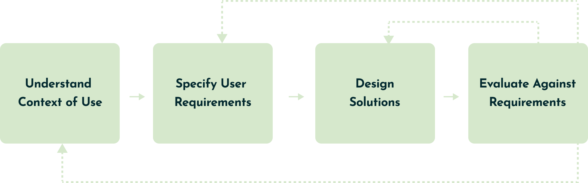
Project Timeline
Week
1
Understand
Context of Use
Week
2
Specify User
Requirements
Week
2-4

Design
Solutions
Week
4-6
Evaluate Against
Requirements
Understanding the Context of Use
Breaking Down the Existing Portfolio
Lloyd’s portfolio was functional but lacked soul. Here’s where the issues were...
01
Poor Information Hierarchy
Key sections were buried, making it hard for recruiters to scan and find relevant information.
02
Confusing Navigation
The user journey was unclear, making it difficult for visitors to explore Lloyd’s work and skills efficiently.
04
No Personal Branding
Without a logo or cohesive design, the portfolio didn’t feel like Lloyd’s. There was lack of a distinct identity.
03
Unpolished
Design
The design felt outdated and inconsistent, failing to match Lloyd’s modern skills.
As I analyzed the website, it became clear that:
Lloyd needed a stronger personal brand and a website that emphasized and showcased his skills to recruiters and potential clients with a modern, sleek design.
Specifying User Requirements
What Users Really Want
I understood that to create an effective portfolio, it was essential to prioritize the needs of the primary users (recruiters and potential clients). To achieve this, I conducted research to identify their key requirements.
Research revealed the following recurring requirements, further validating what Lloyd’s website needed to be more user-centered for potential clients and recruiters.
01
Quick Access to Information
Users wanted easy, fast access to Lloyd’s key details without digging through buried sections.
02
Clear Showcase of Projects
Visitors needed an organized, intuitive portfolio that clearly displayed his work, process, and outcomes.
03
A Strong, Modern Brand
Users expected a polished, cohesive design that reflected Lloyd’s professional identity and expertise.
04
Easy Navigation & Responsiveness
A smooth, user-friendly experience across devices was essential for effortless browsing and quick access to content.
Specifying User Requirements
Personas & Empathy Maps
Persona

Name: Sarah Green
Role: Technical Recruiter
Location: Markham, ON
Goal: Quickly assess a developer’s skills and experience to determine if they’re a good fit for job opportunities.
Sarah says...
"I need to see a developer's skills and experience in seconds. If I can't find what I need fast, I move on."
Background
Sarah works in a fast-paced hiring environment with tight deadlines, reviewing multiple portfolios daily to identify strong candidates. She prioritizes clarity, structure, and relevant experience, needing to quickly assess a developer’s skills to determine if they’re a good fit for job opportunities.
Pain Points
Needs & Motivations
Empathy Map
Thinks
Says
Feels
Does
Designing Solutions
Bringing Lloyd’s Brand to Life
Crafting Lloyd’s personal Brand
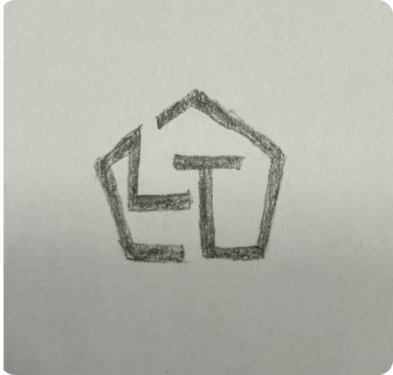
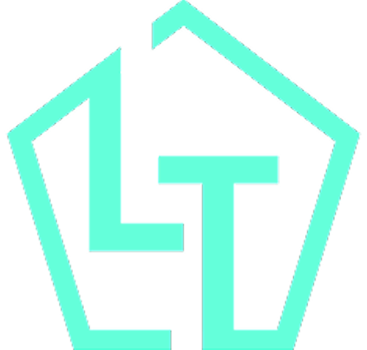
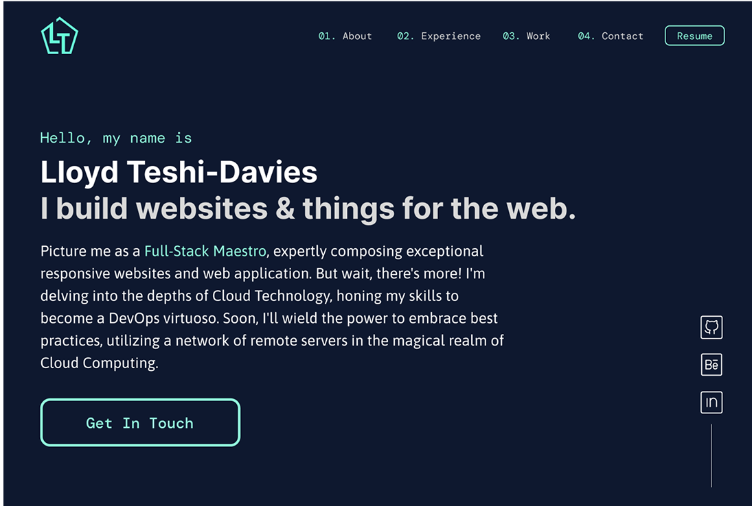
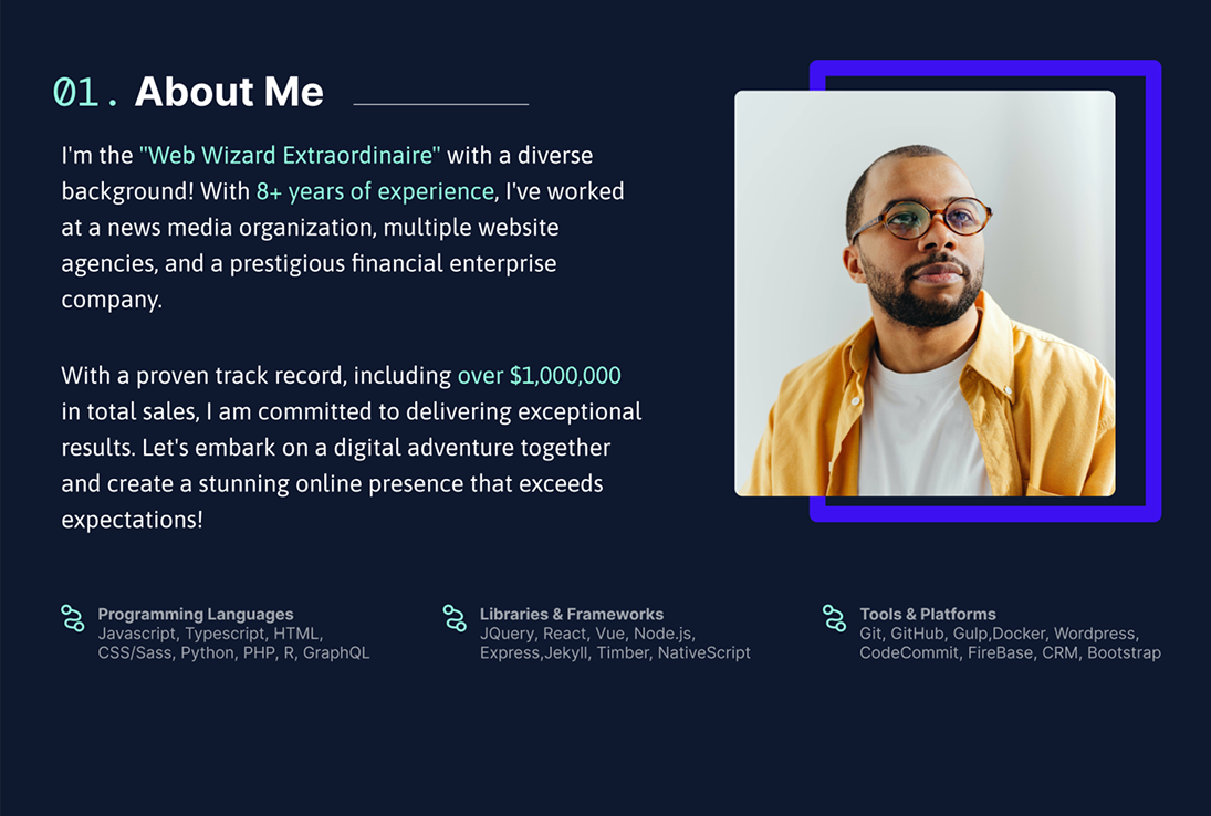
After talking to Lloyd, I understood that he wanted a clean, modern logo that showed his web skills and professionalism. Using the rough sketch and brand colours he provided, I created a simple, geometric logo that felt trustworthy and tech-focused. This logo became the start of his new personal brand.
Improving UX & Information Architecture
I created an Information Architecture (IA) map to organize the website’s content and ensure intuitive navigation.

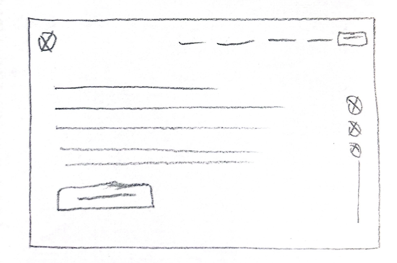
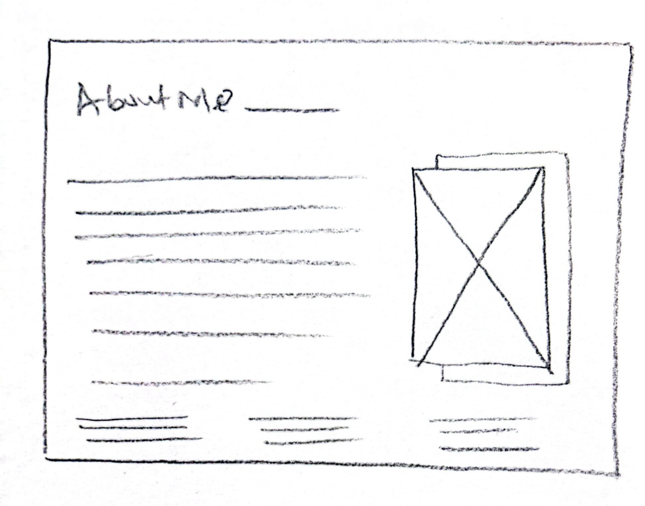
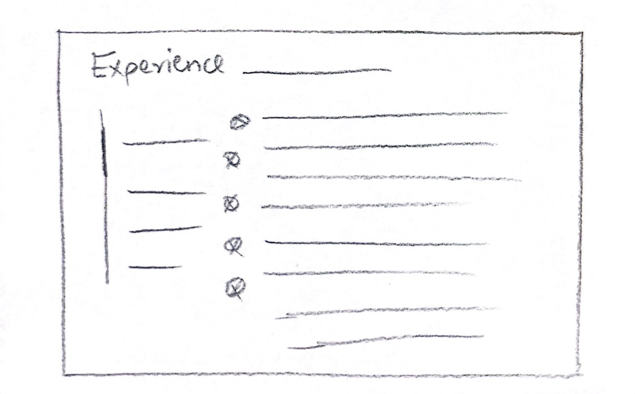
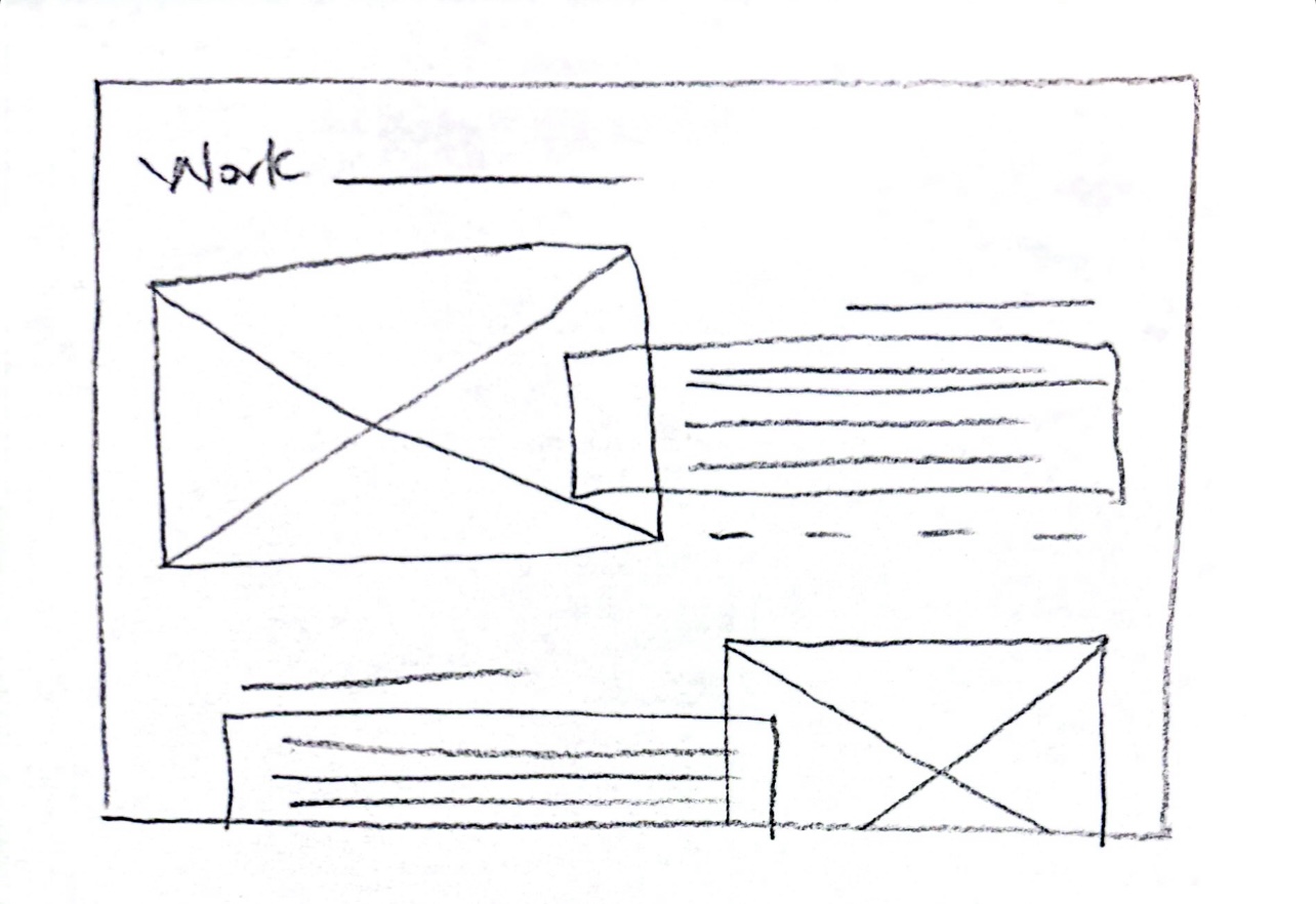
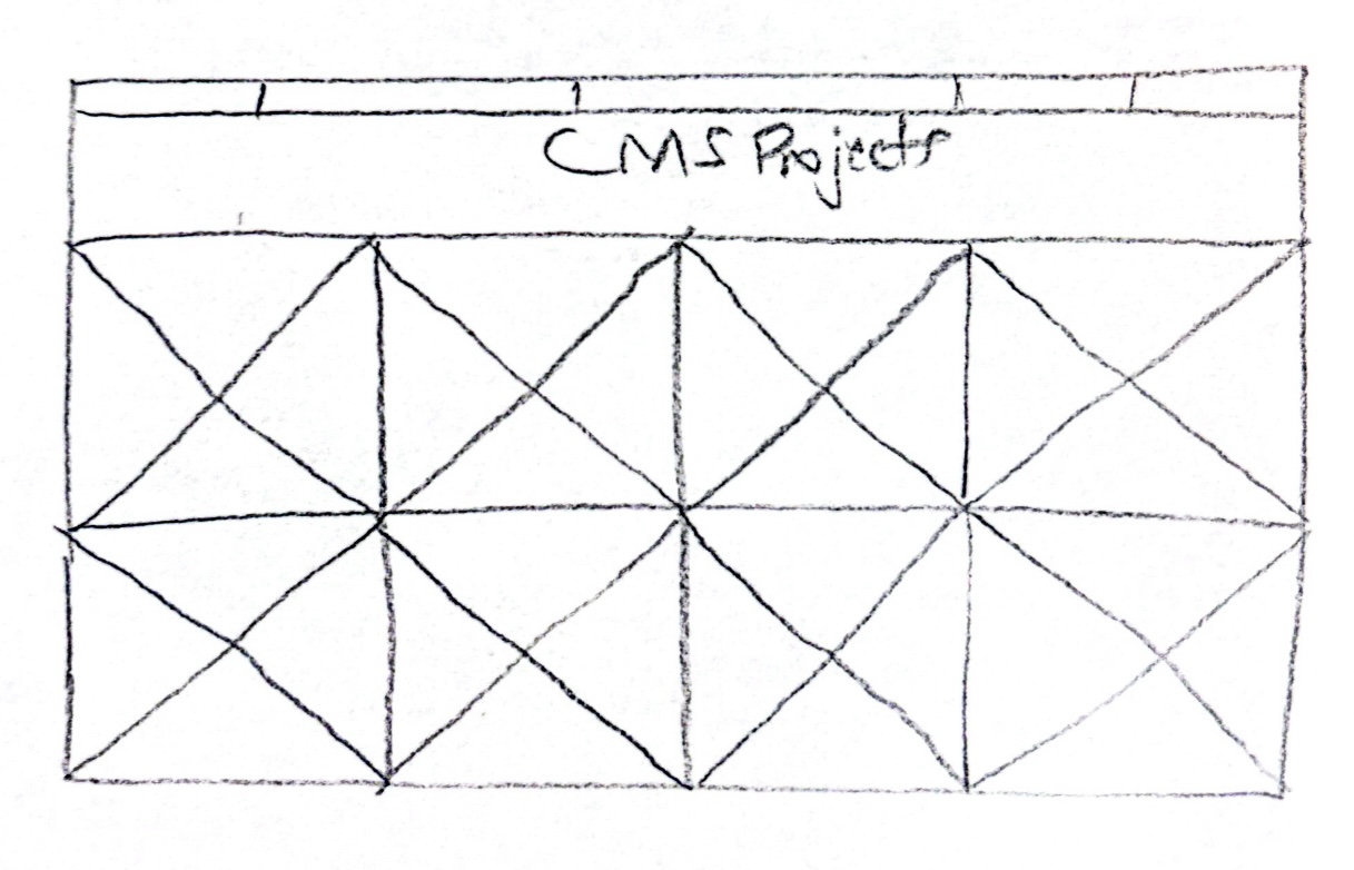
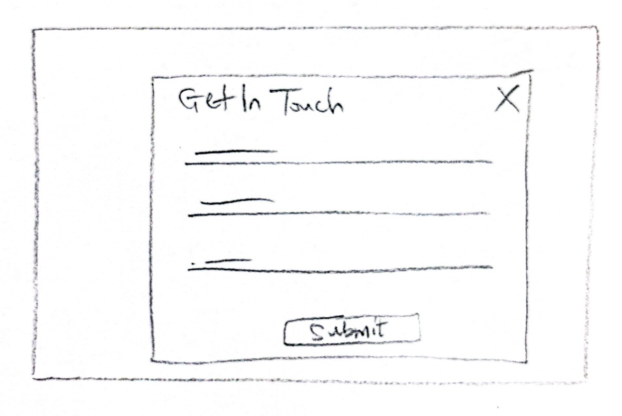
Paper wireframes
Sketching the website layout involved creating a simple, intuitive navigation system; organizing sections into clear categories: About, Experience, Work, Contact, so recruiters and potential clients can quickly skim the website and grasp all key information at a glance; and including a strong hero section with a brief introduction and call-to-action (CTA) to guide users towards contacting Lloyd.
Mid-fidelity wireframes
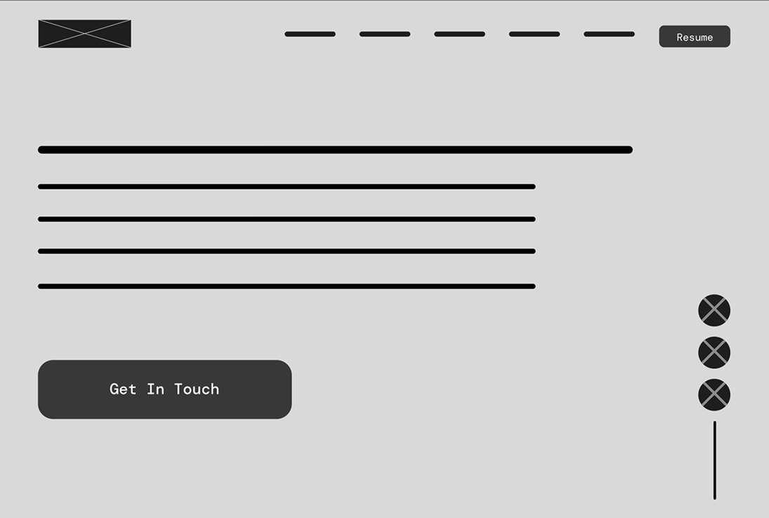
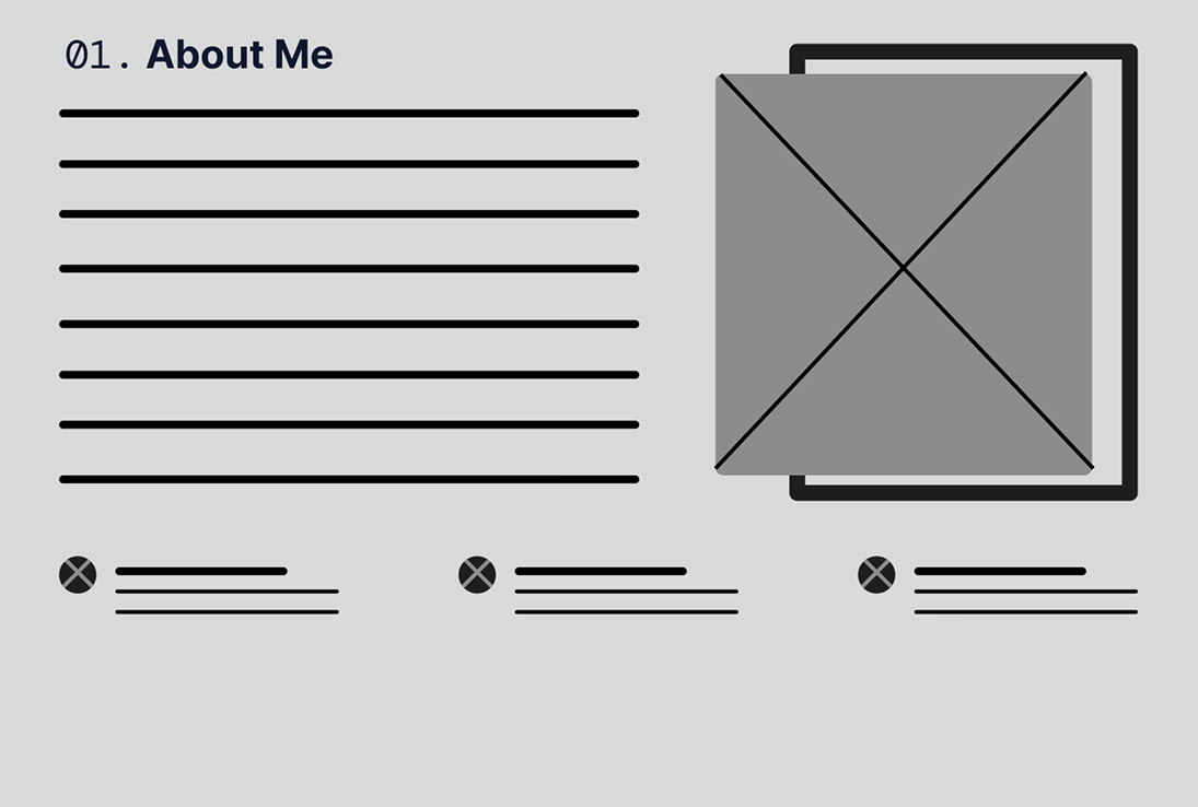
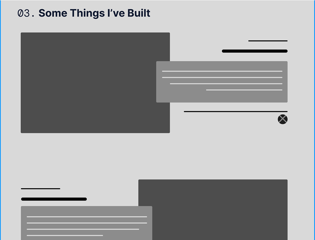
High-fidelity wireframes
Mobile Design
Understanding that recruiters might access the website on the go, I ensured the website was fully mobile-responsive.
Evaluate Against Requirements
Measuring design choices against Lloyd’s goals.
Usability Testing
Objective:
To evaluate how easily users can navigate and interact with Lloyd’s portfolio website, and identify any usability issues that may affect the user experience.
Method:
Participants were asked to complete 3 tasks using the prototype. The tasks were designed to simulate real-world actions, such as finding key information (skills, projects), and navigating the site.
Tasks assigned
Findings & Insights
Strengths
Area of Improvement
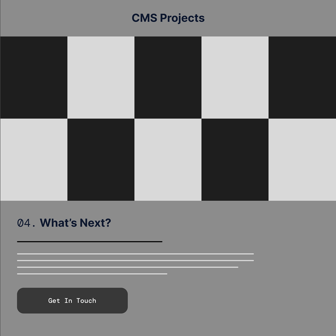
The Outcome
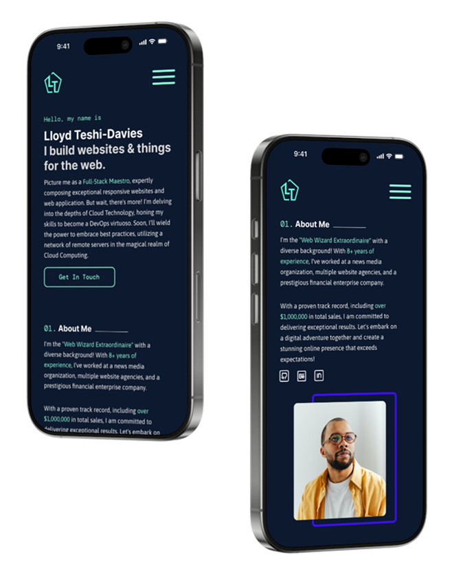
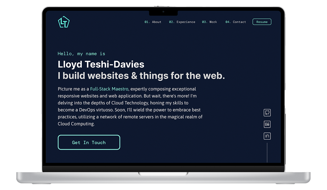
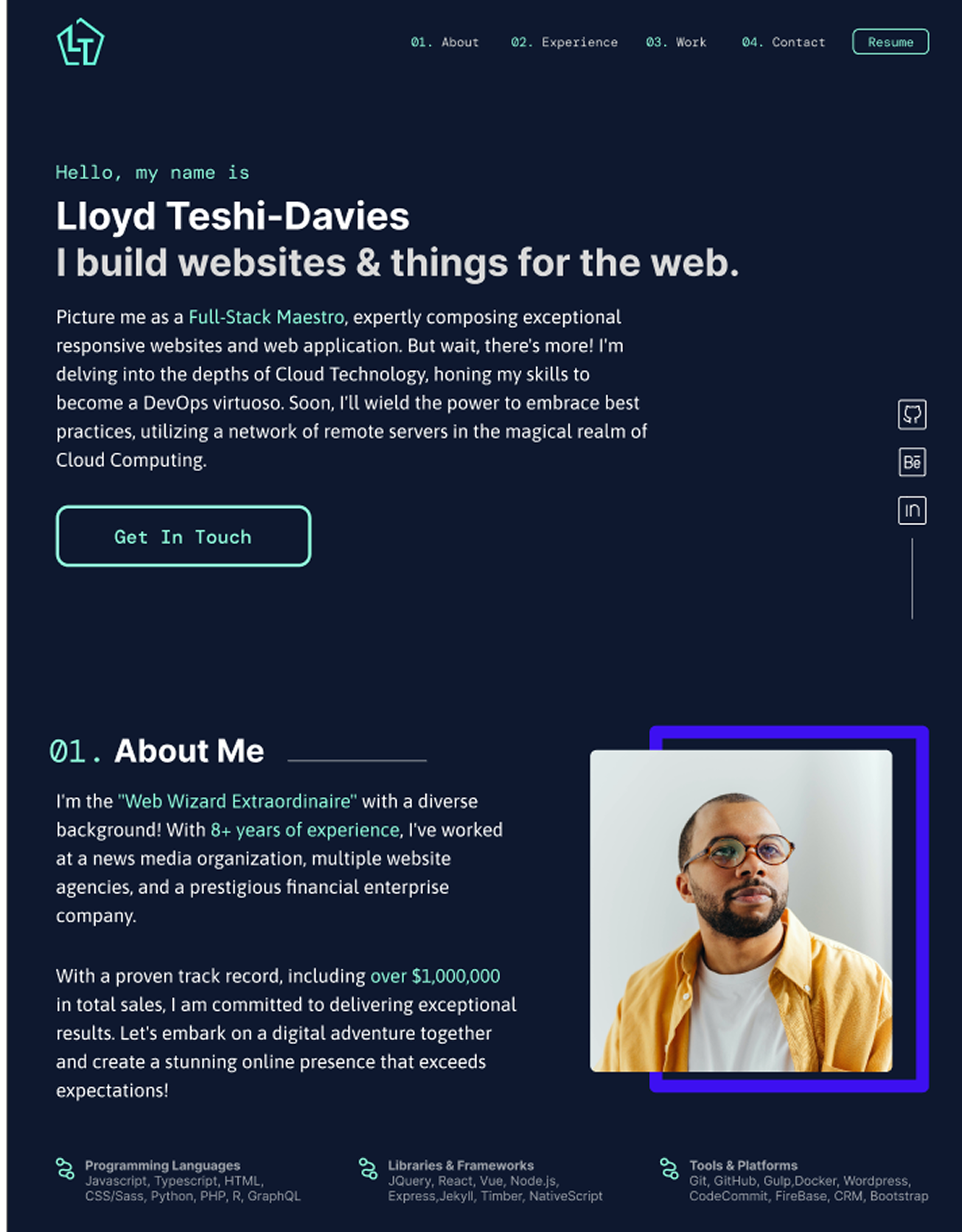
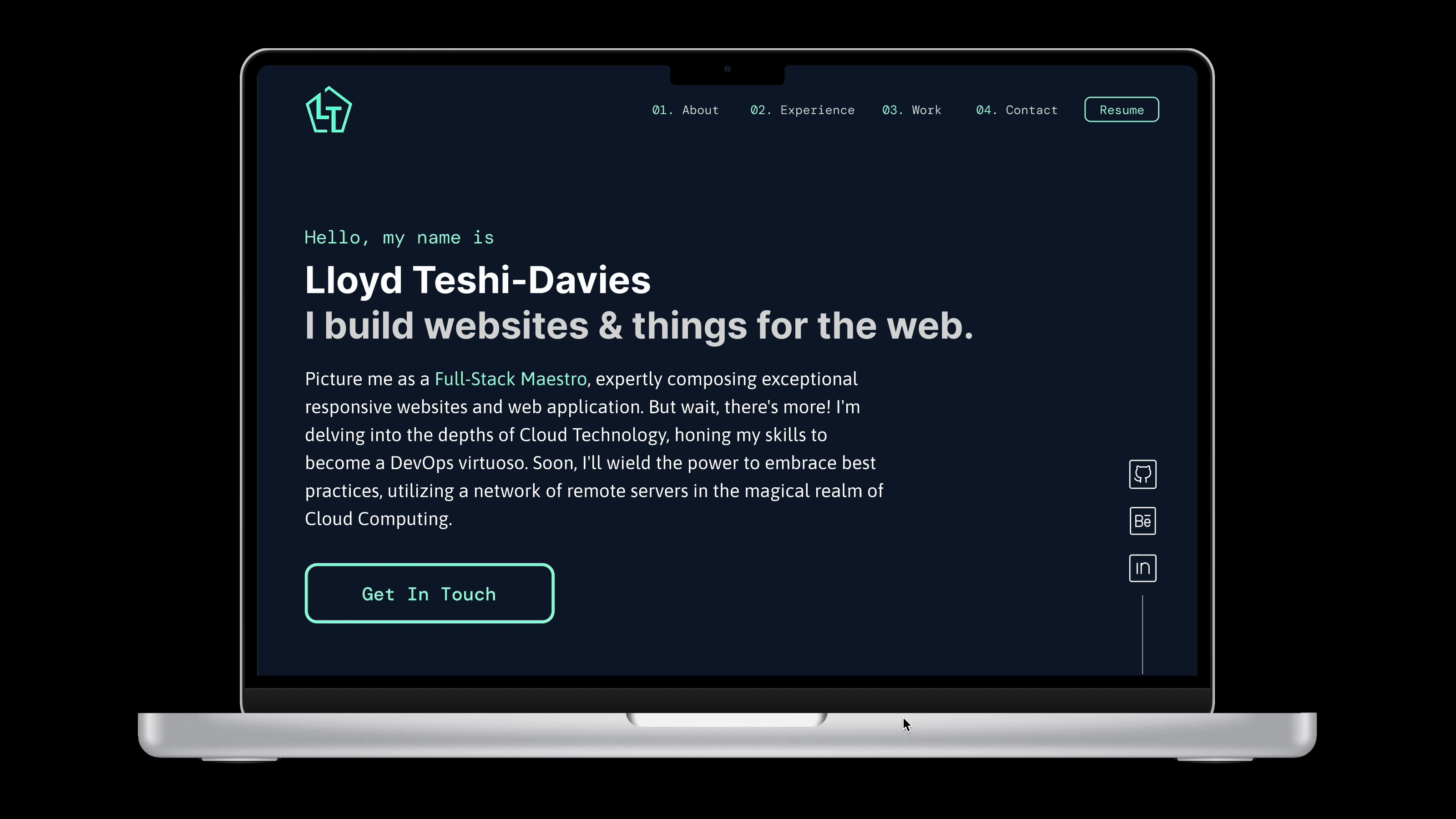
A Polished, Professional Portfolio
Before
After
Before
After
Before
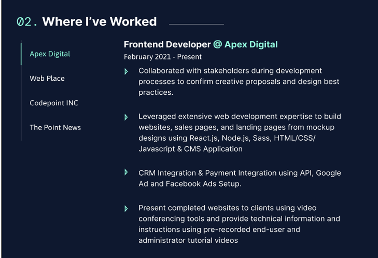
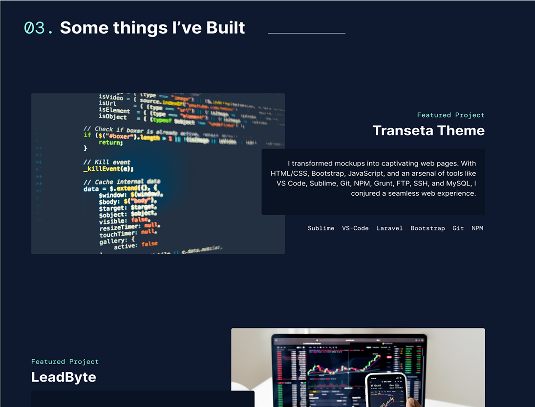
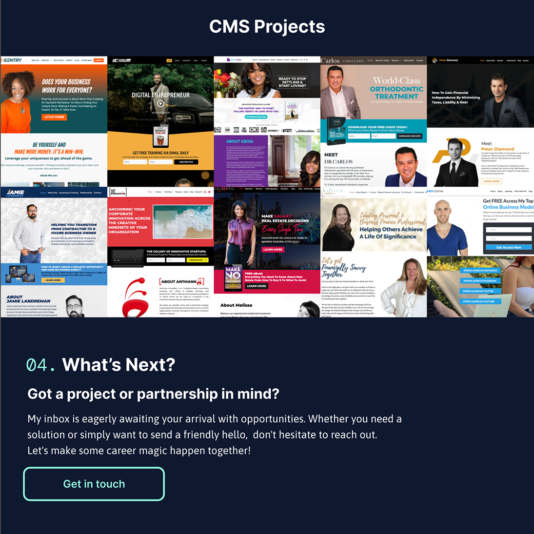
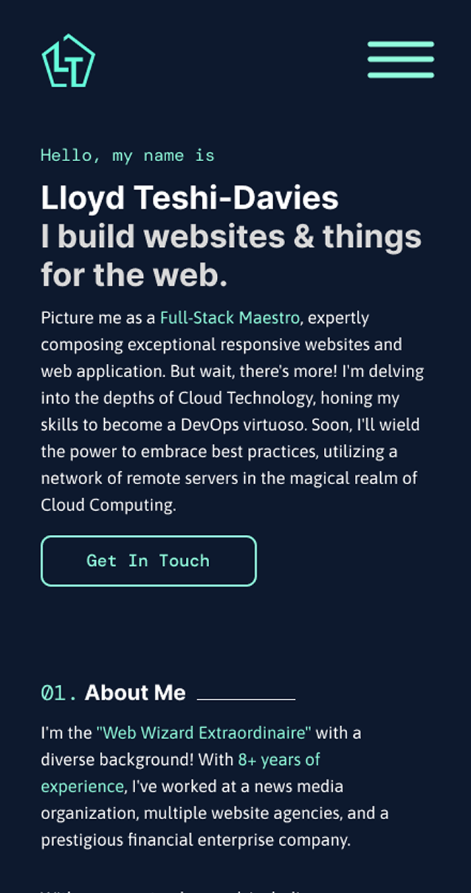
Lloyd’s website was outdated, lacked clear navigation guides, lacked a clear brand identity, and failed to showcase his talents effectively.
Now
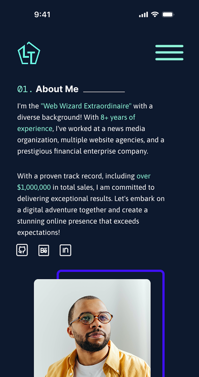
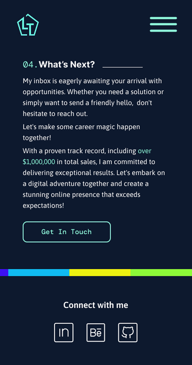
The redesigned portfolio is clean, modern, and professional, exactly what Lloyd needed to stand out. The redesigned navigation makes it easier to scan for relevant information. His personal brand is now reflected in his logo and cohesive design.
The case studies are clearly laid out with descriptions, and his resume can be downloaded for a deeper look into his experience and skillset.
Reflection
Takeaways
The redesigned portfolio is clean, modern, and professional, exactly what Lloyd needed to stand out. The redesigned navigation makes it easier to scan for relevant information. His personal brand is now reflected in his logo and cohesive design.
The case studies are clearly laid out with descriptions, and his resume can be downloaded for a deeper look into his experience and skillset.
© Copyright 2026 Dami Akinloye. all rights reserved.